Cadence Bank
Cadence Bank and Bancorp South merged and rebranded with a new logo and color system. They needed a new website that reflected the personable and helpful in-branch experience they provide their customers.
In addition to bringing their brand to life in a digital space with consideration to accessibility, I successfully pitched and developed a full suite of custom illustrations to aid Cadence in their efforts toward their goal of being a friendly, knowledgeable, and helpful partner to their customers.
Solution
Change for Cadence Bank and Banckcorp South’s customers required understanding and sensitivity. I took the updated logo and color system and landed on design system that brought the highly-helpful and warm experience of Cadence’s in-person banking experience to life online. A flexible component system paired with lighter color tints, helpful scrolling background gradients that cued progress, as well as a brand new, friendly visual system, helped Cadence’s new brand show up polished and professional.
Results
Increased revenue per active user by 800%
Aquired another bank and poised to keep going
Quicker speed to market for digital landing pages
Key consideration
Create a helpful and polished brand to ease the tension of a merger and show up in a positive and trustworthy way.
Perception
Positive customer reception
More visual cohesion
Banking that keeps pace with you.
On bringing the Cadence Brand to life for digital & finding a way to support marketing efforts on the website.
“I don’t want to be demonstrative, but ... this is the best thing I’ve ever seen. I am absolutely blown away. It encompasses everything I had in my mind. How you managed to do that with so little feedback, I can’t even wrap my head around. We want to do all of this... We should be solving for an experience and we’ll figure out the development and how to do it later. I’m greenlighting all of this immediately.”
— Kyle K., Client partner & Product Owner
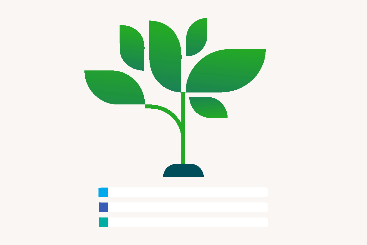
Challenge: Cadence’s visual language was non-existent. They had a new logo and a smattering of generic stock photos. As we designed the website, I pitched the idea of creating a graphic language born from the themes from their new leaf-logo: growth, simple shapes and a bright future.


This allowed us to create a distinct look that offered quick visual ideas and the visual trustworthiness of a top 10 bank experience


Agency: Horizontal
What I did: Illustration, design, system design, full website ui, crossfunctional workflow with the development team, art direction
Skills: Worked with cross-functional teams to get new website launched, Figma, selling ideas
Animation: Lisa Albinson