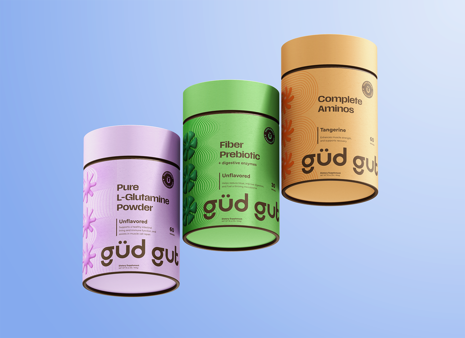
Gud Gut Supplements
The brief for Gud Gut was to build a brand that felt grounded in science but expressed with soul. Gud Gut isn’t about quick fixes or fads—it’s about supporting the natural complexity of the gut biome with intention and clarity. The visual identity needed to echo that balance.
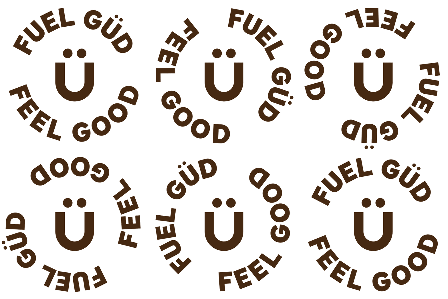
The design system was inspired by the unseen world within us—the diverse microbial life that makes up a healthy, happy gut. I imagined what it might look like if we could peer through a microscope and magnify that ecosystem: an optimistic, living landscape of shape, color, and motion. The result is a series of bold, geometric forms—each one a stand-in for a thriving colony, working in harmony. It’s gut health reframed: not as something sterile or prescriptive, but as something alive, diverse, and worth celebrating. With Gud Gut, the brand experience had to feel as thoughtful as the science behind it—and I’m proud to say we brought that vision to life.
What I did: naming, logo design, design system & guide, art direction, writing


